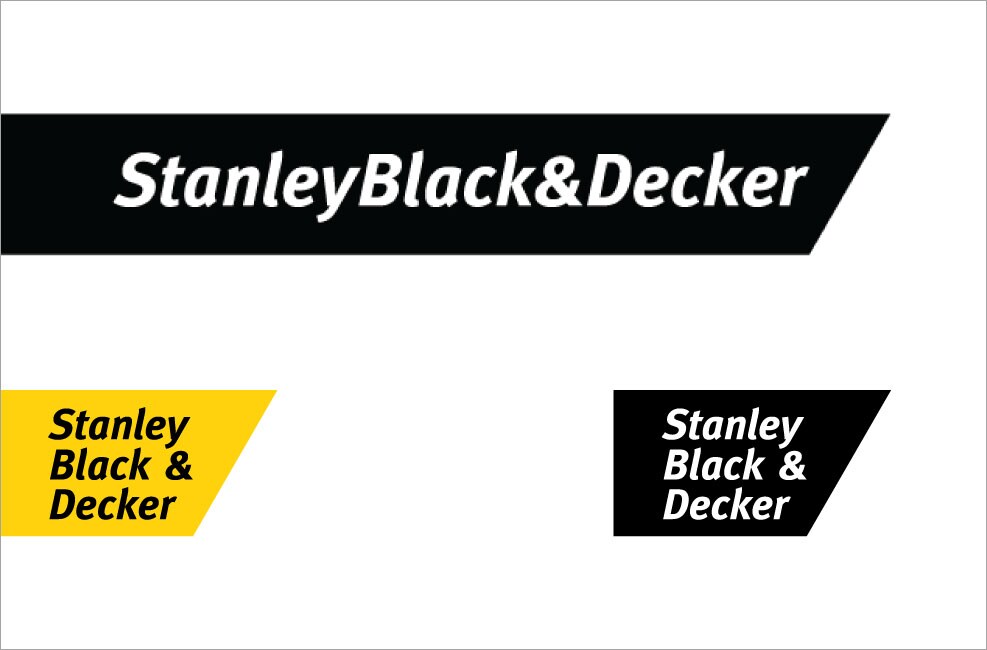
Full-Color Logo
Variations
Logo Placement and Usage
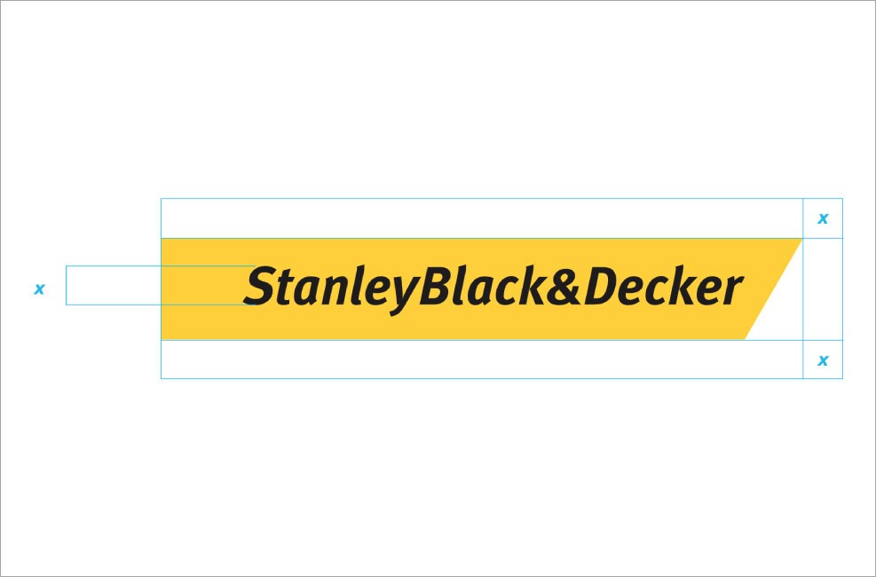
The logo mark preferred placement is anchored on the bottom left or top left of a composition. The left edge of the logo should bleed off the side of the composition.
A minimum amount of clear space must always surround the logo. This space (marked “X”) is equal to the cap height of the letter “S.” Whenever possible, allow more than this amount of clear space. The left side of the logo can and should align and bleed off the left edge of most placements.
Logo Size
In reproducing our logo, consider its legibility in the given context. The logo needs to be easily readable, while also having a size and weight that reflects the strength of our brand.
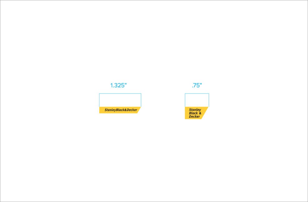
The minimum size use of the Stanley Black & Decker horizontal chevron logo is 1.325”. The minimum size use of the vertical logo is .75”.
Logo Tagline Lockup
Logo Tagline as Headline
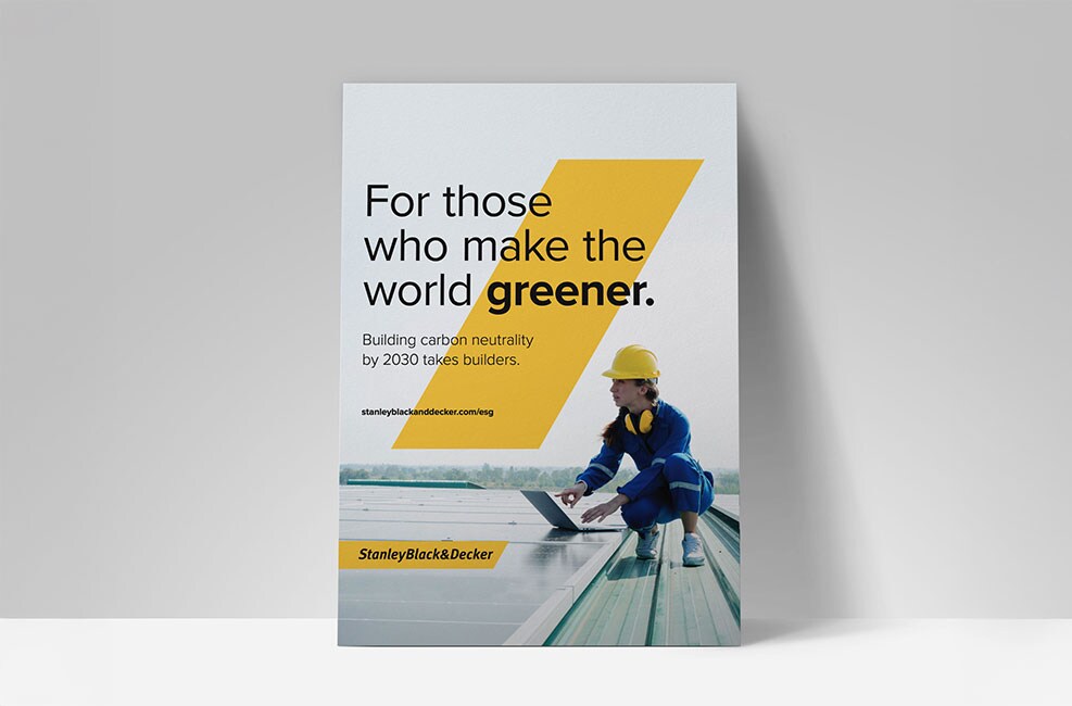
Our tagline can be “modified” and used as a headline by adding a qualifier to the end.
The qualifier should speak to a higher-level brand message or pillar. e.g., “For those who make the world greener.” not “For those who make solar power.”
Never use the tagline within a statement. It should always be a statement of its own.
The tagline as a headline should be typeset in Proxima Nova Regular.
The tagline logo lockup should not be used if we are using the tagline as a headline.


Typography on an Image
When type is used on an image, black type over a light image is preferred. The image background should be free from distracting elements. At times, it may be necessary to alter the image to allow for clear space for type.
If the image is too dark for black type, white may be used.
Type should never cover a product in an image.

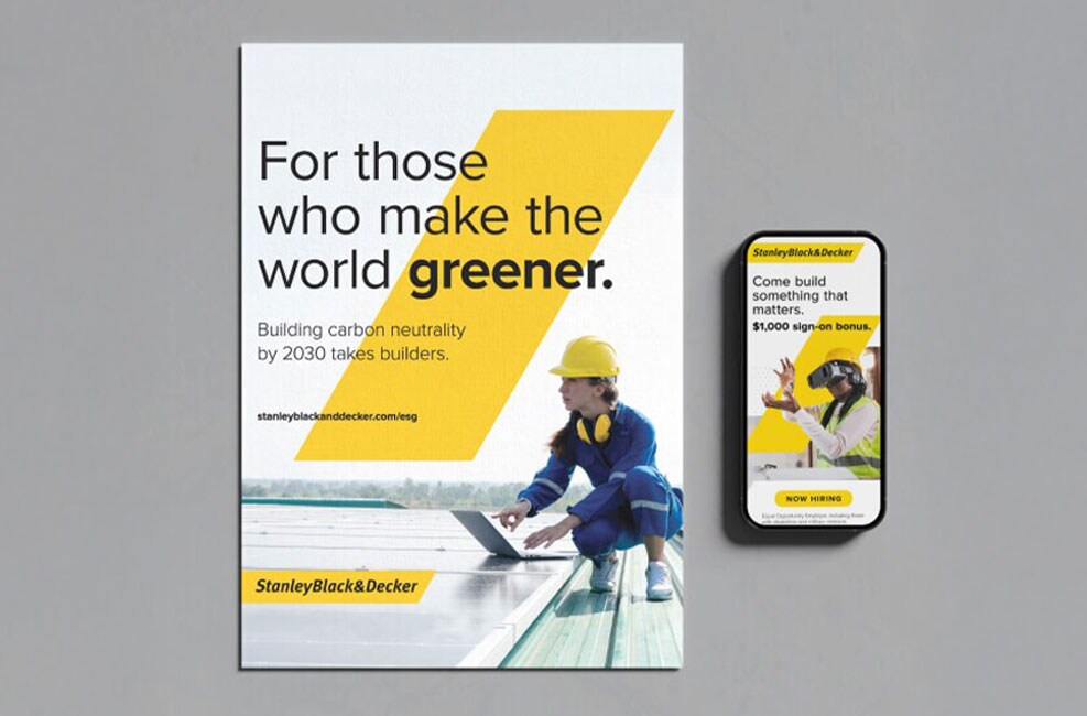
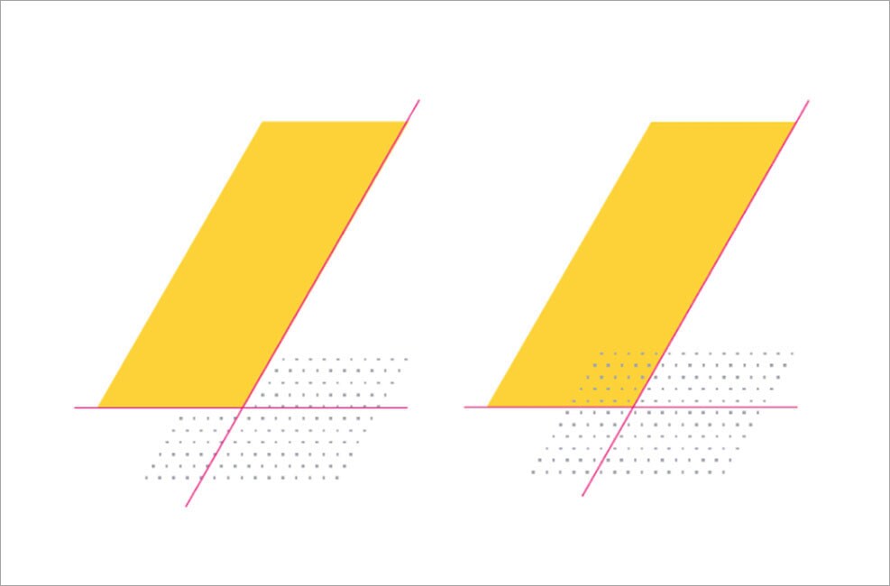
The Primary Slash
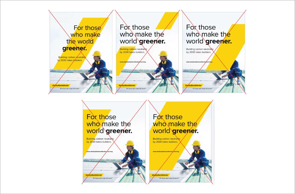
The Primary Slash is the most common way to use the Slash. It is a dominant element in the design.
The Primary Slash can be used on top of a full bleed image or a cropped image on white. The headline should overlap the Slash, and the Slash is always in relation to the headline or a silhouetted image.
The top of the Slash must always be visible.
Approximate Proportions
Image: 30% | White: 40% | Yellow: 30%
What to Avoid
- Never try to set type within the Slash.
- Never use more than one Slash within an ad placement.
- Do not cover the focus of an image with the Slash.
- Three sides of the Slash must always be visible to maintain the integrity of the mark.
- Do not overpower a placement with the Slash. Maintain the proportions of color outlined above.
The Slash Usage
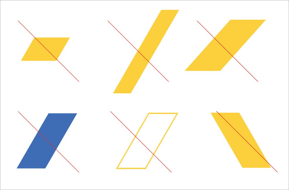
The Slash should always appear in Stanley Black & Decker Yellow. The Slash is provided as an EPS file. This file should always be used to maintain the correct proportions of the Slash in all instances.
What to Avoid
- Never alter the proportions.
- Never change the color.
- Never outline.
- Never use the Slash in reverse.
The Slash Usage with Logo
The Slash is best used with the logo when one side of the Slash is aligned to the right angled edge of the logo or to the top or bottom edge of the logo.
Note: In certain instances it may not be possible to align the edges of the logo to the slash due to the constraints of the content within an application, but the examples at right show the preferred usage.
- Right edge alignment
- Bottom and top edge alignment
- Left and right edge alignment
The Image Slash
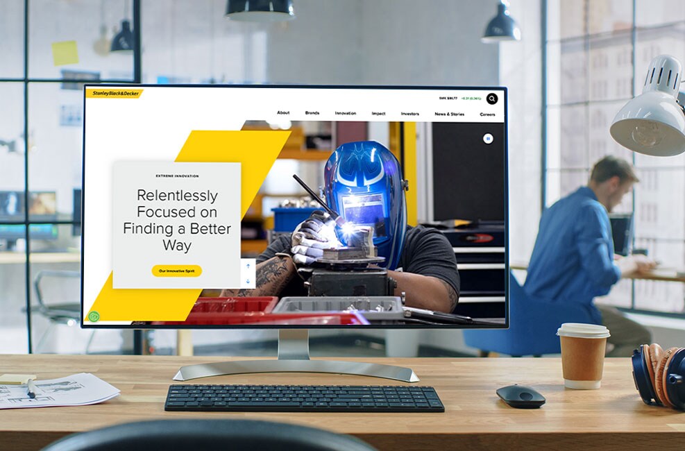
When a hero image is important to the storytelling, the Image Slash should be used. The image itself should be the predominant element on the layout and should bleed off the edge. The Yellow Slash is still critical and should have a recognizable presence overlapping the image, but it should not be the dominant element in the design.
The Slash Image bleeds off the edge. Imagery should maintain the defined space so a clear line is visible. If an image is very light on one edge and the edge blends with the white background, the image will need to be darkened slightly so that the edge of the Image Slash is maintained.
Imagery within the Slash does not need to adhere to the proportions of the Yellow Slash. It may be stretched wider to accommodate the image within.
Approximate Proportions
Image: 70% | White: 15% | Yellow: 15%
What to Avoid
- Do not overpower the image with the Primary Slash.
- Do not crop the image too tight within the Slash. Widen the Slash to accommodate the image within.
- Do not use more than one Yellow Slash.

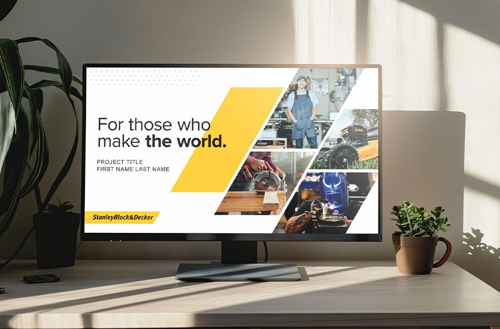
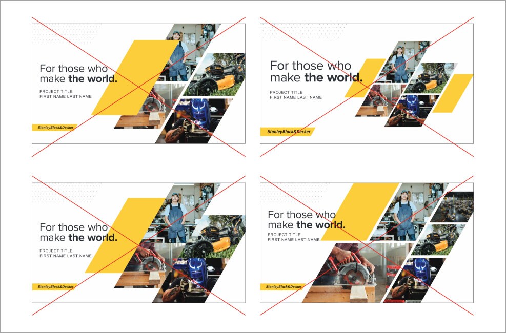
The Multi-Image Slash
The multi-image slash is used in internal documents and presentations.
When multiple images are needed, place them within the Slash. They should never touch one another, but may bleed off the application. The Yellow Slash should not touch as well but should lock up with the images.
Within the imagery, always represent a combination of people, product and industries.
Approximate Proportions
Image: 40% | White: 40% | Yellow: 20%
What to Avoid
- The Yellow Slash should not overlap multiple images.
- Do not use more than one Yellow Slash in a layout.
- Images should not touch. They need a gutter to avoid visually blending into one another.
- Don’t use varied image sizes and proportions in multi-image layouts. Avoid using more than four images. It becomes visually overwhelming with too many images.
The Gray Slash
The Gray Slash is used as a layered element to add depth, particularly when the Yellow Slash would be too overpowering for the content. It is useful as a background element in places such as websites or internal pages of collateral pieces.
It should not be used as a hero element to replace the Yellow Slash in things like social posts, advertising, or collateral covers.


Dot Pattern Horizontal Large

Dot Pattern Horizontal Narrow

Dot Pattern Vertical Large

Dot Pattern Vertical Small
The Dot Slash Usage
The Dot Slash may be used at different sizes, but the pattern should remain clearly visible, distinguishable and recognizable. When they are too small, the dots may not be visible. When they are too large, the angle of the pattern could be lost.
The Dot Slash may stand alone on white, overlap an image or overlap the yellow Slash, but it should never become the dominant design element. It is used as a layering element to provide depth and interest.
When you layer the Dot Slash with the Yellow Slash it is best to align the dots with the Slash.

Line Slash Horizontal Large

Line Slash Horizontal Narrow

Line Slash Vertical Large

Line Slash Vertical Small
Standardized buttons improve user interaction with clear sizing, shapes and hover effects, while a cohesive color palette reinforces brand identity and readability. By adhering to these standards, Stanley Black & Decker creates a unified digital experience that enhances user engagement and trust.